Looking for a banner ad size guide? This article has all the details on standard sizes that run on Google Display and social media ad networks.
What Are the Standard Banner Ad Sizes?
Standard banner sizes are defined by their height and width (in pixels) on a webpage. They refer to the shape, how large or small the ad will appear, and how it will fit among other elements on a page.
Knowing your options is important so you can visualize how your ad will look, and how easily people will be able to see the ad.
Google Display Network Banner Sizes
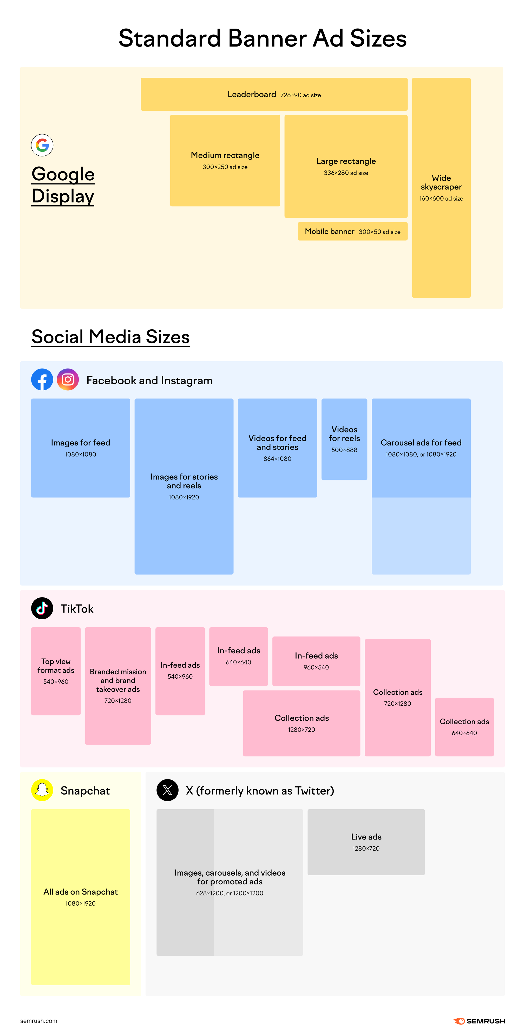
On the Google Display Network, standard banner sizes are the following:
- Leaderboard (728x90 ad size)
- Large rectangle (336x280 ad size)
- Medium rectangle (300x250 ad size)
- Mobile banner (300x50 ad size)
- Wide skyscraper (160x600 ad size)
Ideally, ad file sizes should be less than 150KB to run well on Google Display. They should also be uploaded in one of these formats:
- JPEG
- SWF
- PNG
- GIF
Social Media Banner Sizes
For social media ads, these are the most common sizes:
Facebook and Instagram
- Images for feed should have an aspect ratio of 1:1 and a resolution of 1080 x 1080.
- Images for stories and reels should have an aspect ratio of 9:16 and a resolution of 1080 x 1920.
- Videos for feed and stories need an aspect ratio of 4:5 and a resolution of 864 x 1080.
- Videos for reels need an aspect ratio of 9:16 and a resolution of 500 x 888.
- Carousel ads for feed should have an aspect ratio of 1:1 and a resolution of 1080 x 1080 or 1080 x 1920.
TikTok
- Top view format ads need an aspect ratio of 1:1, 9:16 or 16:9, with a resolution of 540 x 960.
- Branded mission ads should have an aspect ratio of 9:16 and a resolution of 720 x 1280.
- Brand takeover ads need an aspect ratio of 9:16 and a resolution of 720 x 1280.
- In-feed ads require an aspect ratio of 9:16 and a resolution of 540 x 960, 640 x 640 or 960 x 540
- Collection ads require an aspect ratio of 1:1, 9:16, or 16:9, with a resolution of 640 x 640, 720 x 1280, or 1280 x 720.
Snapchat
- All ads on Snapchat (whether image, video, collection or story format) should have an aspect ratio of 9:16 and a resolution of 1080 x 1920.
X (formerly known as Twitter)
- Images for promoted ads need an aspect ratio of 1:1 or 1.91:1.
- Videos for promoted ads need an aspect ratio of 1:1 or 1.91:1 with a resolution of 628 x 1200, or 1200 x 1200.
- Carousels for promoted ads need an aspect ratio of 1:1 or 1.91:1
- Pre-roll ads in the amplify format require an aspect ratio of 1:1 or 16:9, with a resolution of 1200 x 1200.
- Sponsorship ads in amplify required an aspect ratio of 1:1 or 16:9, with a resolution of 1200 x 1200.
- Trend takeover ads need an aspect ratio of 16:9.
- Live ads should have a resolution of 1280 x 720.
Choosing the size of a banner ad will depend on your ad strategy, and the desired goal of your ad(s).
Factors that can influence this decision include what device your audience uses, the text and image size in your ad, where the ad will be featured, your messaging, and the call-to-action (CTA) of the ad.
Importance of Using Standard Sizes
Banner ads appear in social, display, and video channels, and can be a mixture of text and images. In fact, banner ads are so common that the average person sees over 1,700 banner ads per month.
In such a competitive space, marketers have to have intentional ad strategies that factor in all design aspects of a banner ad, including size.
Digital advertising is similar to printed advertising, where standard banner sizes allow brands to advertise on billboards and other spaces in public. Online, publishers provide specific units for digital ads, and these units typically have size specifications that are determined by the Interactive Advertising Bureau.
Knowing and designing ads based on standard sizes means that all components of your ad are visible on a page (you don’t spend time having to edit designs retroactively) and that you have a granular understanding of the online ad world.
Standard ad sizes are widely accepted and have played a part in the effectiveness of banner ads. Brands that therefore follow standard ad sizes have a higher chance of a successful ad campaign.
Common Banner Sizes
Web banners are ads that feature on blogs, ecommerce sites, and digital publications. The most common network to place these types of ads is the Google Display Network. These ads can be used to increase traffic to a targeted landing page, increase brand awareness, and increase brand revenue.
Web banner sizes
There are five common sizes for Google Display banner ads.
1. Leaderboard (728 x 90 ad size)
A Leaderboard banner ad has a 728 pixels width and a 90 pixels height; it can also be called a Super banner. This type of ad banner is normally at the top of an online page, and so is one of the first things that users see.
Leaderboard ads are favorable because they are so visible and immediately draw people’s attention.
Subsequently, there’s a higher chance that leaderboard ads will be clicked on and encourage conversions. Leaderboard ads are positioned above the fold on web pages (the line where users have to begin scrolling to view more of the page) and so are effective because they are readily seen before users begin navigating.

2. Large rectangle (336 x 280 ad size)
The large rectangle ad was delisted by the IAB as it was not often accommodated on ad networks. The ad would sit on the side of content in the shape of a large rectangle, and saw relative success as a banner.
3. Medium rectangle (300 x 250 ad size)
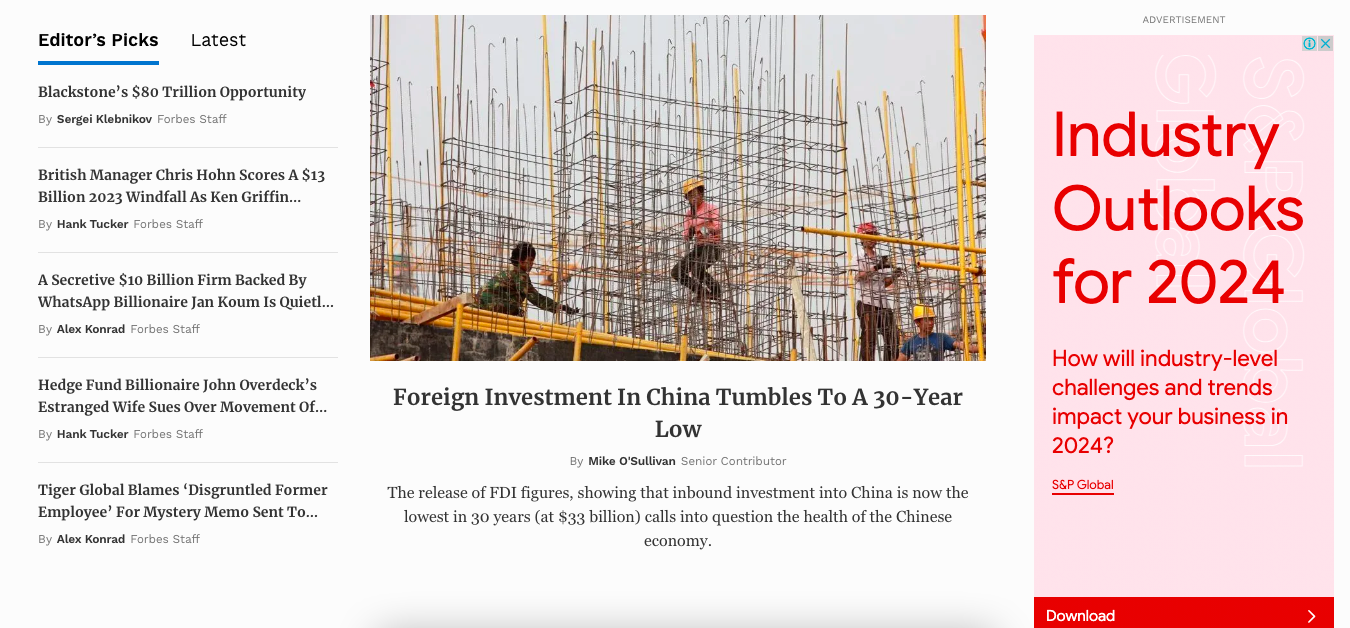
A medium rectangle ad is the smaller version of the now delisted large rectangle ad. It has a height of 300 pixels with a 250-pixel width. It is also known as an MPU or Med Rec ad.
Medium rectangle ads are popular with marketers because they are useful for both desktop and mobile advertising, and have sufficient space for brands to tell a story without being too consuming on pages.
4. Mobile banner (300 x 50 ad size)
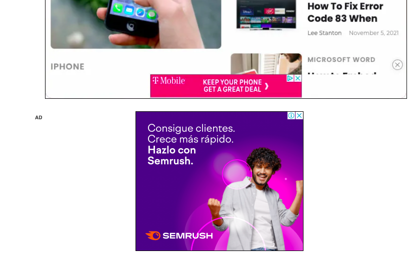
Mobile banners are 300 pixels wide and 50 pixels tall, and appear on mobile devices. They are one of the smaller ad sizes available, and are reasonably priced.
Naturally, the smaller sizing means that brands have less space to include ad copy, images, and interactive media in these ads, however, they can produce big ROI if curated well. They tend to feature at the top or bottom of mobile screens.

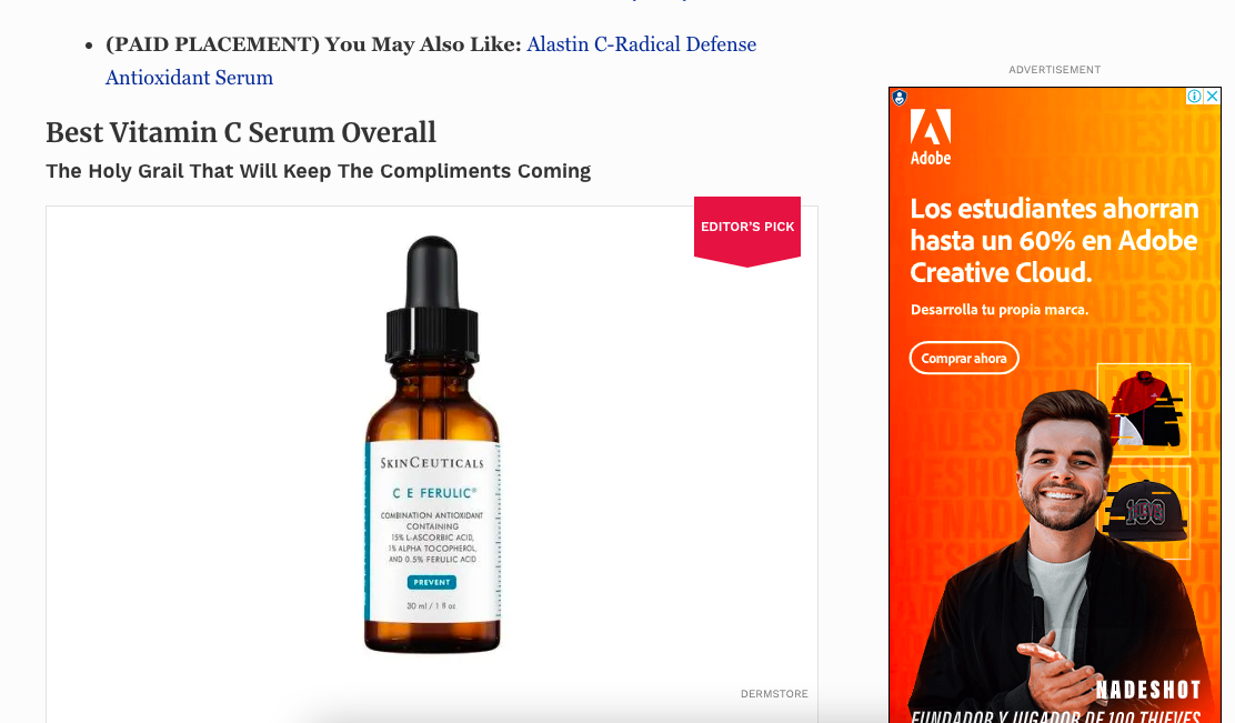
5. Wide Skyscraper
While these are the standard sizes of web banners, the format of each ad can be different. For example, ads can be static, animated, interactive, expandable, pop-up or transitional. Whatever dynamic you choose for your ad, try to design with one of the above five sizes in mind.
Factors to Consider When Choosing Banner Sizes
There are a few things to take into account when selecting the right banner size for your ad and brand.
These factors can have a big impact on your ads’ performance, as well as how the ad looks on the page, and how easy it is to read and understand. Before deciding your banner size, think about these elements:
Target audience
Who your ad is talking to should play a big role in the size of your banner. The demographics and behaviors of your target audience will change how people engage with your ad and should determine how the ad is formatted and sized.
For example, younger audiences may respond better to small, more discreet banners that don’t disrupt the flow of the user experience.
Old demographics may prefer larger banners that are clearer and more obvious in their positioning.
Similarly, if your target audience most commonly uses Facebook, you may want to research the most popular banner sizes for Facebook ads in order to best resonate with the desired people. Your audience will tell you their preferred platform, and the platform should inform the banner size you choose.
Banner placement
Where an ad appears has a direct correlation to its success. Placement affects visibility, click-through rates, and the overall effectiveness of an ad campaign.
You should consider what platforms your target audiences use, and prioritize ad banners on these platforms.
Likewise, where on the page your ad shows can help yield better results. For instance, native advertising – where banner ads seamlessly integrate with surrounding content – can feel less intrusive to audiences and bring positive results.
Alternatively, placing banner ads at strategic points of the customer journey can increase the chance of conversions.
Budget
Ads cost money and unsurprisingly, your banner ad strategy will be driven by your company budget.
Popular platforms and high traffic websites tend to have higher advertising costs, however, if that is where your target audience primarily are, it may be worth the investment.
Spend time assessing the cost per impression or click across different platforms and try to allocate your budget accordingly to ensure optimal reach without overspending.
Remember to track and analyze performance metrics over time to reshuffle budget allocation toward the best-performing banner ads.
Your budget should be centered around your brand goals. If you’re focusing on conversions, budget should be given to ads that have proven conversions. If you’re focusing on subscribers, budget should be given to ads that inspire sign-ups.
Messaging
Your messaging is what tells people a story and represents your brand – it’s how you capture people’s attention and how you demonstrate that your ad has real value.
Your message should be concise and read well within the space that you’ve chosen for your ad. If you have lots of text or detailed images, a bigger sized ad will be necessary.
You should also consider if you want to run A/B tests to experiment with your messaging. If so, ask yourself how much will you change the messaging in your ad, and will that require a banner ad size change also?
Equally, think about the context that your ad will appear in – if it’s on a platform with lots of text-heavy content, perhaps a smaller ad with animated messaging would be more attractive to users.
Creating Banner Ads to Size with AI
AdCreative.ai (available in the Semrush App Center) is an AI-powered platform that creates ad creatives for better conversions. The tool can generate more than 180 ads and banners within seconds, and can contribute to 14x higher conversions and click-through-rates.
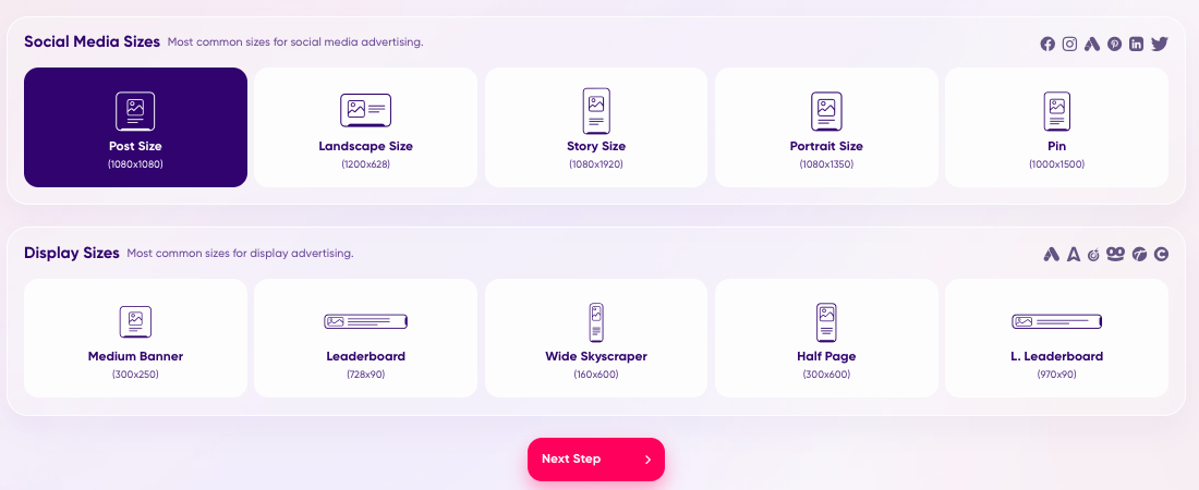
No previous design experience is necessary to use the app. You can choose ads for social media or display ads, and the platform will automatically size the ad based on your preferences. The list of sizes available are all fit for Google Display and social media banner ads.
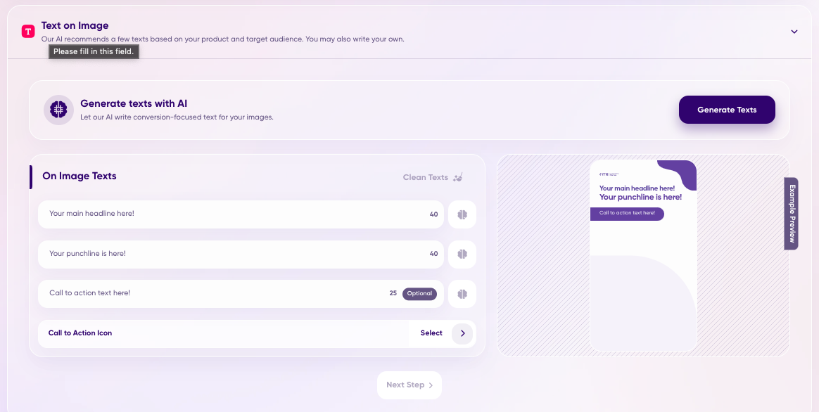
You can then enter text that you would like to show on your ad, broken down by headinline, body text, and call-to-action (CTA). AdCreative.ai ensures that the copy fits neatly and clearly within the ad size.
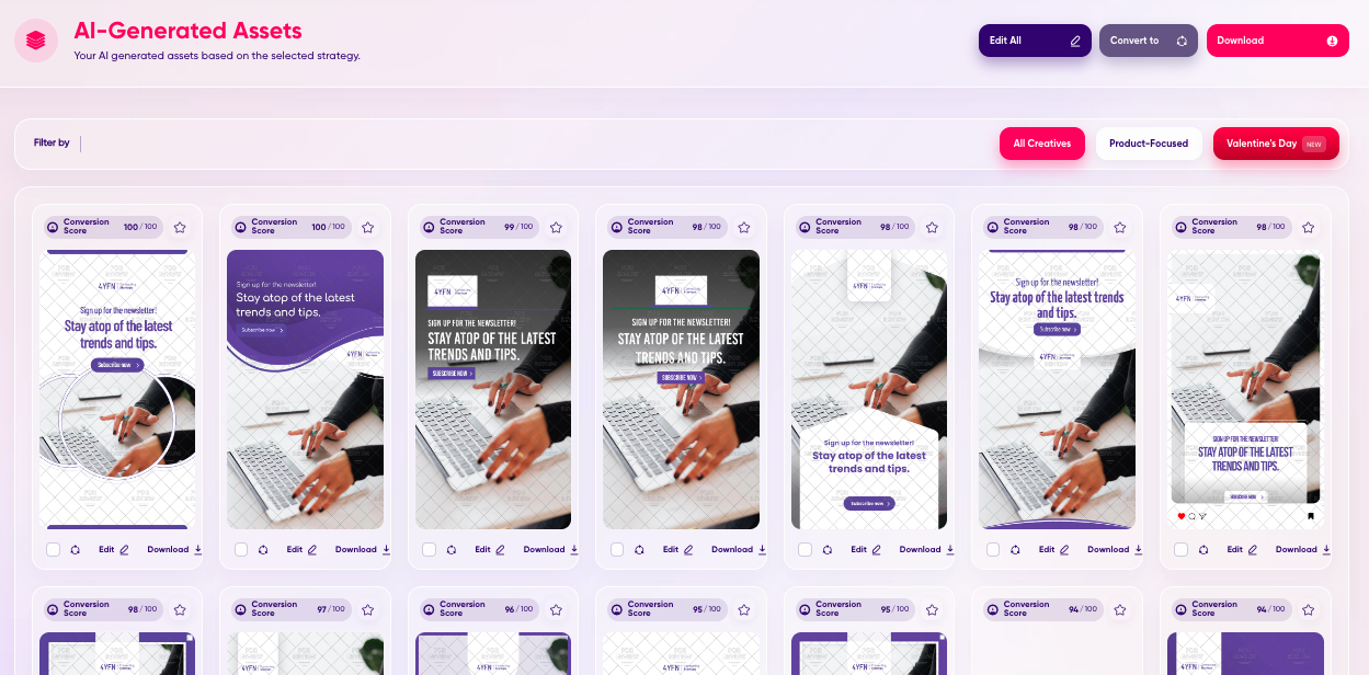
Afterward, you can browse a large selection of ad creatives, each with the optimal size. Every suggestion includes a score out of 100 for the creatives’ conversion ability, plus actionable tips to improve the ad’s outcomes.
As a result, you can implement high-potential ads in less time, with maximum impact.
Final thoughts
Banner ad size is the foundation of any great campaign because it’s the template you give your brand to tell a story and prompt people to act. They can be just as important to an ad strategy as where, when, and to whom your ad is shown.
But you don’t need a designer to know the right banner ad sizes – you can leverage sophisticated AI tools like AdCreative.ai and implement smart, lucrative, scaled ads in seconds.
